Perfect Harmony: MHC Painting’s Guide to Balancing Color and Design in Shared Spaces
Creating a harmonious balance of color and design in shared spaces can significantly enhance the aesthetics and functionality of your environment. At MHC Painting, we understand the nuances of achieving this balance and the impact it can have. Whether it’s a family living room, a co-working office, or a community lounge, shared spaces require thoughtful design choices to ensure they are both inviting and versatile.
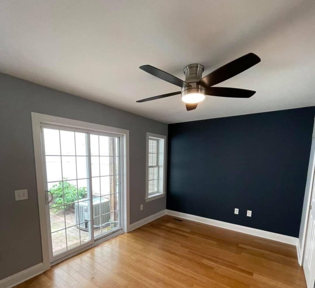
When considering your color palette, it’s essential to recognize the purpose of the space and the emotions you wish to evoke. For instance, calming blues and greens can create a tranquil atmosphere ideal for relaxation or focused work, while vibrant reds and yellows might stimulate conversation and energy. At MHC Painting, our experts often recommend starting with a neutral base, which provides versatility and allows accent colors to truly shine without overwhelming the space.
Color psychology plays a vital role in interior design, especially in shared areas. Neutral tones such as beige, gray, and soft white offer a clean canvas that can easily be accented with bolder hues through accessories or one focal wall. Consider the current use of your space. If it serves a dual purpose, such as a home office that doubles as a guest room, the colors should enable the transition between roles seamlessly.
Lighting is another critical factor that impacts how colors appear. Natural light can alter color perception throughout the day, so it’s crucial to test paint samples in your space at various times to see how they react. MHC Painting recommends using a consistent color scheme throughout open-plan areas. This continuity creates a cohesive look that naturally guides the eye from one space to another without abrupt transitions that can disrupt the flow.
Furniture and décor should complement your color scheme rather than compete with it. For instance, if you choose a bright color as a feature wall, opt for furnishings in softer, complementary shades to avoid overwhelming the senses. Incorporating textures through different materials, such as wood, metal, or fabric, can add depth and interest without relying solely on color.
Customization for functionality and aesthetics is where MHC Painting shines. We suggest a bespoke approach to every project, considering both your aesthetic goals and practical needs. Our team can assist you in selecting high-quality, durable paints that suit the specific requirements of shared spaces, such as scuff resistance for high-traffic areas.
Don’t forget the ceiling and the flooring, which are often overlooked elements that can dramatically affect the overall perception of your space. A lighter ceiling can make a room feel larger and more open, while a darker ceiling may provide an intimate and cozy feel. Likewise, your choice of flooring, whether tiled, hardwood, or carpeted, should harmonize with your chosen color palette and functional needs.
As you plan your next project, remember that successful design in shared spaces is about more than just selecting the right colors. It’s about understanding the space’s purpose, the mood you want to create, and how those elements can coexist beautifully. At MHC Painting, we’re here to guide you every step of the way, ensuring your shared spaces not only meet practical needs but also promote a sense of community and ease.
By carefully considering these elements, you can transform any shared space into an environment that is both aesthetically pleasing and functional. Let MHC Painting help you create a setting that balances color and design perfectly, ensuring everyone who enters feels at home.